Showing posts with label Digipack. Show all posts
Showing posts with label Digipack. Show all posts
Monday, 29 November 2010
Friday, 12 November 2010
Possible Cover and Inlay
Front Cover 1 or Inside Cover 1:
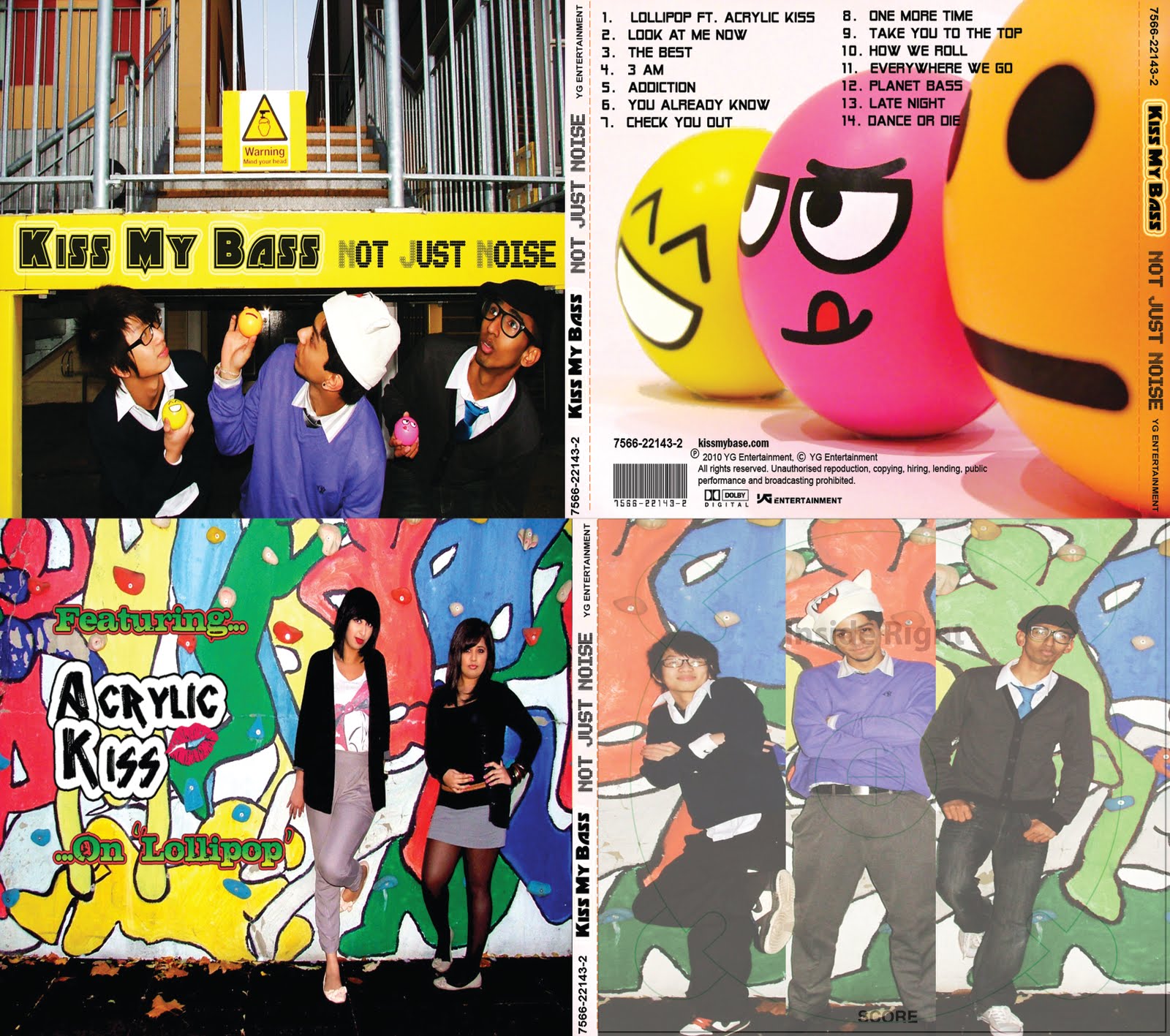
 The above, could be used for the inside cover as it would not be suitable for the front as the artists are not looking at the camera causing it difficult to see their faces. For a debut album, especially, the artists should get as much exposure as they can so it can be clear for the audience who the artists are. If I decide to release this album as the band's second album for example, I could use this as the album cover if the album as it would not be debuting. The image of the boys not looking directly at the camera would then be suitable for the cover as they would be already identified by the audience. By taking advantage of what was around me, I thought it would be quite humourous to have the band stand under a sign warning people to mind their head, of course I told the band 'not to mind their head', causing a sense of rebellion as they are teenagers after all.
Front Cover 2 or Inside Cover 2:
I though this picture was the best for the front cover, as it is so colourful yet dark. The contrast between the two reflects my 'Lollipop' video, where bright costumes are complemented by a dark environment and setting. The title I though could go at the top in front the threes. In this way, the branches may be covered slightly but the colour of the sky would illuminate through. I made this by changing the hue of the sky, to make a alien like/meteor shower skyline. I then selected the buildings either side and on a separate layer, I changed the brightness and contrast to darken them to go with the night time theme. I also changed the hue of the wooden panels on the left building from a dull brown to indigo. To make sure the windows were reflecting the right colour of the sky, I selected just the windows and changed their hue to match the sky colours. Lastly I selected the foreground (the boys) to change their brightness and contrast on a another layer. For finishing touches I used the clone tool to clean up the edges around the boys, and used the blur tool to give them an airbrushed look.
 The above, could be used for the inside cover as it would not be suitable for the front as the artists are not looking at the camera causing it difficult to see their faces. For a debut album, especially, the artists should get as much exposure as they can so it can be clear for the audience who the artists are. If I decide to release this album as the band's second album for example, I could use this as the album cover if the album as it would not be debuting. The image of the boys not looking directly at the camera would then be suitable for the cover as they would be already identified by the audience. By taking advantage of what was around me, I thought it would be quite humourous to have the band stand under a sign warning people to mind their head, of course I told the band 'not to mind their head', causing a sense of rebellion as they are teenagers after all.
Front Cover 2 or Inside Cover 2:

I though this picture was the best for the front cover, as it is so colourful yet dark. The contrast between the two reflects my 'Lollipop' video, where bright costumes are complemented by a dark environment and setting. The title I though could go at the top in front the threes. In this way, the branches may be covered slightly but the colour of the sky would illuminate through. I made this by changing the hue of the sky, to make a alien like/meteor shower skyline. I then selected the buildings either side and on a separate layer, I changed the brightness and contrast to darken them to go with the night time theme. I also changed the hue of the wooden panels on the left building from a dull brown to indigo. To make sure the windows were reflecting the right colour of the sky, I selected just the windows and changed their hue to match the sky colours. Lastly I selected the foreground (the boys) to change their brightness and contrast on a another layer. For finishing touches I used the clone tool to clean up the edges around the boys, and used the blur tool to give them an airbrushed look.
Front Cover 3 or Inside Cover 3:


Another possible cover of the boys against a rock climbing wall. It is more colourful than the above, as no sky or sense of day light showing. I started off with three different images, then cropped them all before pasting them into a separate transparent canvas. From using the original images, I selected the part I wanted to overlap on to the neighbouring image to make it look as if they are in the frame but not quite out their own as a whole. I then realised the outline of the person on the wall was red (as same as the middle image), so I changed the hue and saturation of it and changed the colour to green.
Inlay showing the girl band feature on 'Lollipop' song:

I have chosen a name for this girl band which is, 'Acrylic Kisses'. The name was found on amiright.com. I like the composition of this photo, where the girls are standing on the right while there is much background on the left representing an urban scene of which my video captures. To ensure the girls are not overshadowed by the colourful background, the dark colours they wear cause them to stand out against the background. There is now even exposure of both them and the colourful background. I used taaz.com to enhance the girls makeup creating redder lips, and heavier makeup than they originally wore for the photo shoot. I also changed the colour of their hair, making one's more solid and darker (the left girl) and for the girl on the right, browner with more shine. The ground looked slightly gray, so I changed the contrast to make it darker. While for the overall image, I changed the contrast and brightness levels to give a professional photo finish.

I have chosen a name for this girl band which is, 'Acrylic Kisses'. The name was found on amiright.com. I like the composition of this photo, where the girls are standing on the right while there is much background on the left representing an urban scene of which my video captures. To ensure the girls are not overshadowed by the colourful background, the dark colours they wear cause them to stand out against the background. There is now even exposure of both them and the colourful background. I used taaz.com to enhance the girls makeup creating redder lips, and heavier makeup than they originally wore for the photo shoot. I also changed the colour of their hair, making one's more solid and darker (the left girl) and for the girl on the right, browner with more shine. The ground looked slightly gray, so I changed the contrast to make it darker. While for the overall image, I changed the contrast and brightness levels to give a professional photo finish.
Wednesday, 10 November 2010
The set up of the photoshoot of the possible back cover

I had laid some white paper around and curved the back to hide any 'cracks' in the paper. The curved paper would have been used in a real photo shoot to make the background look like one solid base. To prevent the stress balls from rolling away, I had to use BluTack to keep them stuck to the paper. I also had to do this with the paper to stop it from flopping down forward.
I have began to PhotoShop one of the photos I took which I thought looked best for the back cover.
To make a creative closeup, I had used the macro setting on the camera (flower symbol), to create a narrow depth of field. The camera focuses on the middle stress ball while slightly blurring the orange and yellow ball. In PhotoShop, I had used the clone stamp to remove the cracks between the paper to make it look like one solid background.
I then changed the contrast of the balls to correct the vibrancy of the colours. As for where the track list could go, it could possibly feature on the right of the image. To do this, I will have to extend the right of the image by cloning the white space on the right of the balls. I would then have to resize the image to prevent it from being too wide.
Subscribe to:
Posts (Atom)