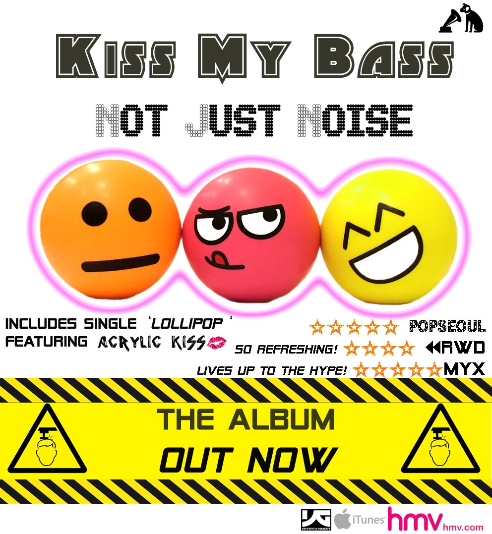
Dear Moderator,
I hope you have enjoyed looking through my blog posts and Prezi presentations and finally, enjoyed my final video and ancillary texts. :)
annyeong! (that's 'Goodbye' in Korean!)
Hasina Kara
Thursday, 9 December 2010
Goodbye!
Wednesday, 8 December 2010
Director's Commentary for Evaluation Q3
The video is also embedded in my Prezi document for this question.
Saturday, 4 December 2010
Monday, 29 November 2010


Sunday, 28 November 2010
Friday, 26 November 2010
Final Video
In order to create traffic towards my video, I used Twitter to tweet the link to people, asking them to comment and rate my video. I received a direct message from someone I am following on Twitter who viewed the video:
Wednesday, 24 November 2010
Tweet from MTV Korea
I tweeted MTV Korea asking them what they think the target audience is for K-POP, they replied saying:
"In korea, the audience for K- pop is very broad. Anywhere from elemantary to 30's go crazy over them. I guess the core target is realistically 15-19 but surely not limited to that."
Tuesday, 23 November 2010
Marketing Campaign involving YG Entertainment
MTV K (MTV channel dedicated to Korean Americans) have an article on their website regarding YG Entertainment, the record label I want to market my band (who also market real band 'Big Bang'). The article reads that the record label have acquired much attention by fans who are puzzled by their mysterious timer posted on the label's blog. There is speculation that the timer has something to do with Big Bang's comeback as their comeback was around late October/early November. It was reported that their comeback may be pushed back to December. The timer was posted on the YG Entertainment blog on 22nd November and after gaining so much attention, MTV K had published the report on the same day. This marketing campaign is very effective as the record label is involved in a campaign which drops hints about what it is promoting but does not reveal it. Instead, fans are forced to speculate and make links between album release dates and possible comebacks of bands and artists. The speculation and attention brings the record company media publicity therefore advantaging the band or artists involved.
Promotion for Album
On Twitter I looked for trending topics involving the word 'K-Pop' and found in one tweet that South Korean boy-band 'Super Junior' had won the 'Best K-Pop group' category at the 2010 ASAP Pop Viewers Choice Awards. I then searched for trending topics with involving 'Best K-Pop group' which had many results.
Date searched: 23/11/2010

This award ceremony would be an ideal place to promote an already established band such as my band. For promotion for their new album, they could perform at the awards, present an award and talk to reporters on the red carpet while mentioning the album release date. All of this would tie in the marketing campaign of the band's new album.
Sunday, 21 November 2010
Album Cover Responses
I have posted the potential covers on facebook, so people can choose which they prefer. I have mentioned in the caption, what each image would be used for, for example; back cover, front cover 1, inlay 2 etc. I have also included the survey link to create more traffic for the survey.
Public Album Link:
http://www.facebook.com/album.php?aid=302086&id=517680497&l=1834110f2b
Friday, 19 November 2010
Special Effects
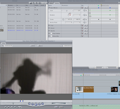
From the feedback, I was praised on the zoomed shadow effect I created by changing the scale and moving the center off the image. I use this only once throughout my video, so I decided to use it again where it was necessary.
Looking through my video, I noticed much of the effects I used were scattered throughout. The more colour visuals were at the beginning and middle, so I decided to use the vector colour effect which I had not use before.
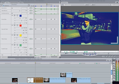
This involved using key frames, where I had to add a key frame to every colour and mixer and change the amount of highlight, saturation and black. While moving along the timeline, I would add another key frame and repeat the process this time choosing different colours. Towards the star and end of this clip, I made the colour mixer low so that there is a smooth transition into and out of colour.
Thursday, 18 November 2010
Kwik Survey

My suspicion is that this particular scene will not be a familiar one to many of those I question. In order to combat this, I plan to include a question on bands of a similar nature in order to gauge a suitable target audience.
Saturday, 13 November 2010
Feedback from the Rough Cut
The feedback I received from the class:
The Good Points:
- Good use of visual effects
- My piece works well with odd shots of the body e.g. the shot of the boy looking up at the camera after falling
- The footage of the dancing in the studio which had shadows - it was good how I scaled the footage to show the shadows while showing a little bit of the dancer doing the moves
- The footage cuts to the beat of the music
- The continuity of the dancing was good how it goes from studio to street
- The corridor shots were effective and looked good
- The 'let me show if that's okay' sequence was good
- Some of the lip syncing was off with the music
- One of the girls is better than the other with the lip syncing
- One particular boy and girl need to improve the lip syncing
- More choreographed dancing from the girls would be good to add in
I plan to reshoot the lip syncing at another location, possibly somewhere local as I understand that is the most important to improve on. While I am re-shooting this, I will film more choreographed dancing. I could then consider cutting this dance footage in one of the female choruses of the song.
Friday, 12 November 2010
Possible Cover and Inlay
Front Cover 1 or Inside Cover 1:
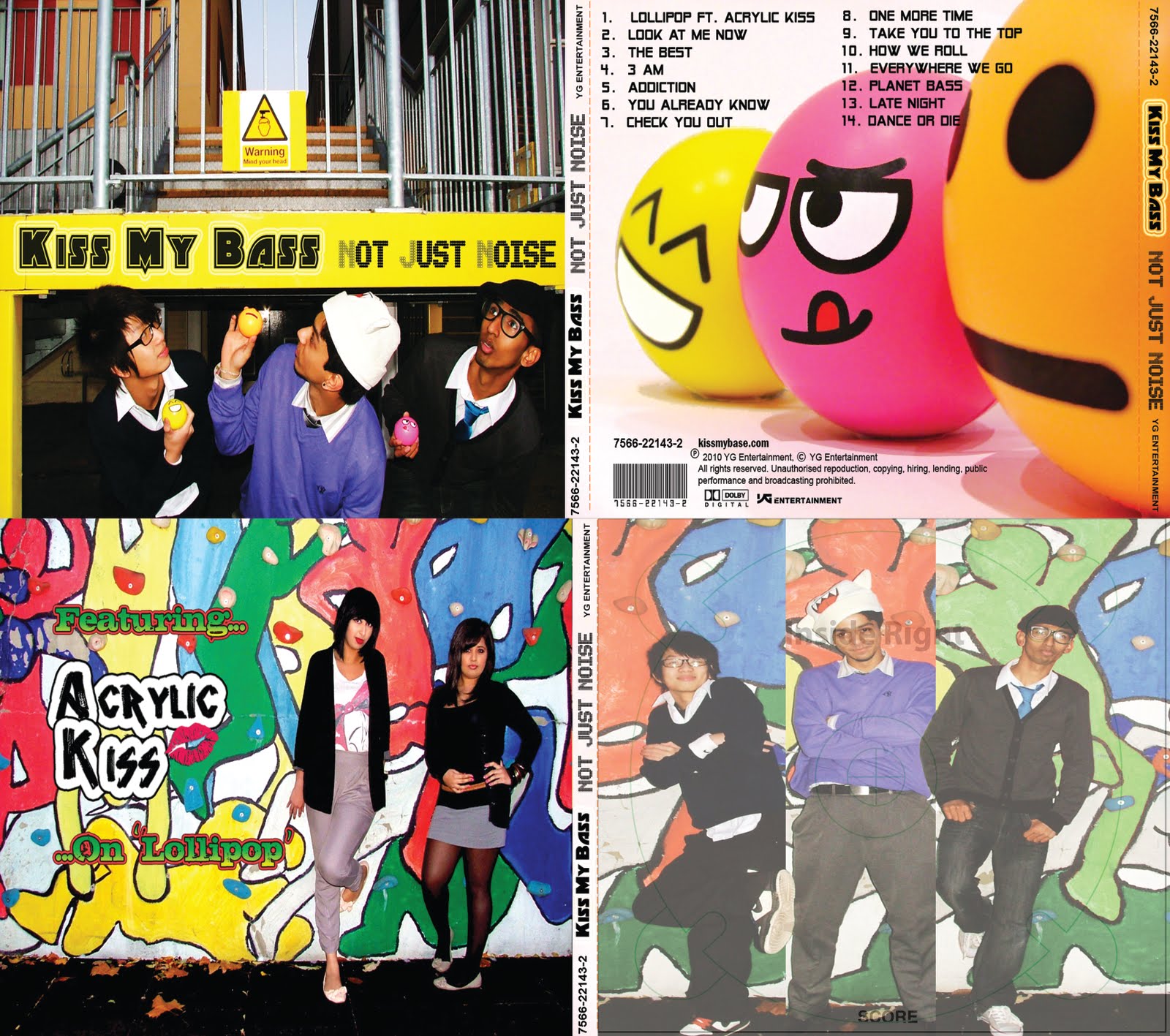
 The above, could be used for the inside cover as it would not be suitable for the front as the artists are not looking at the camera causing it difficult to see their faces. For a debut album, especially, the artists should get as much exposure as they can so it can be clear for the audience who the artists are. If I decide to release this album as the band's second album for example, I could use this as the album cover if the album as it would not be debuting. The image of the boys not looking directly at the camera would then be suitable for the cover as they would be already identified by the audience. By taking advantage of what was around me, I thought it would be quite humourous to have the band stand under a sign warning people to mind their head, of course I told the band 'not to mind their head', causing a sense of rebellion as they are teenagers after all.
Front Cover 2 or Inside Cover 2:
I though this picture was the best for the front cover, as it is so colourful yet dark. The contrast between the two reflects my 'Lollipop' video, where bright costumes are complemented by a dark environment and setting. The title I though could go at the top in front the threes. In this way, the branches may be covered slightly but the colour of the sky would illuminate through. I made this by changing the hue of the sky, to make a alien like/meteor shower skyline. I then selected the buildings either side and on a separate layer, I changed the brightness and contrast to darken them to go with the night time theme. I also changed the hue of the wooden panels on the left building from a dull brown to indigo. To make sure the windows were reflecting the right colour of the sky, I selected just the windows and changed their hue to match the sky colours. Lastly I selected the foreground (the boys) to change their brightness and contrast on a another layer. For finishing touches I used the clone tool to clean up the edges around the boys, and used the blur tool to give them an airbrushed look.
 The above, could be used for the inside cover as it would not be suitable for the front as the artists are not looking at the camera causing it difficult to see their faces. For a debut album, especially, the artists should get as much exposure as they can so it can be clear for the audience who the artists are. If I decide to release this album as the band's second album for example, I could use this as the album cover if the album as it would not be debuting. The image of the boys not looking directly at the camera would then be suitable for the cover as they would be already identified by the audience. By taking advantage of what was around me, I thought it would be quite humourous to have the band stand under a sign warning people to mind their head, of course I told the band 'not to mind their head', causing a sense of rebellion as they are teenagers after all.
Front Cover 2 or Inside Cover 2:

I though this picture was the best for the front cover, as it is so colourful yet dark. The contrast between the two reflects my 'Lollipop' video, where bright costumes are complemented by a dark environment and setting. The title I though could go at the top in front the threes. In this way, the branches may be covered slightly but the colour of the sky would illuminate through. I made this by changing the hue of the sky, to make a alien like/meteor shower skyline. I then selected the buildings either side and on a separate layer, I changed the brightness and contrast to darken them to go with the night time theme. I also changed the hue of the wooden panels on the left building from a dull brown to indigo. To make sure the windows were reflecting the right colour of the sky, I selected just the windows and changed their hue to match the sky colours. Lastly I selected the foreground (the boys) to change their brightness and contrast on a another layer. For finishing touches I used the clone tool to clean up the edges around the boys, and used the blur tool to give them an airbrushed look.
Front Cover 3 or Inside Cover 3:


Another possible cover of the boys against a rock climbing wall. It is more colourful than the above, as no sky or sense of day light showing. I started off with three different images, then cropped them all before pasting them into a separate transparent canvas. From using the original images, I selected the part I wanted to overlap on to the neighbouring image to make it look as if they are in the frame but not quite out their own as a whole. I then realised the outline of the person on the wall was red (as same as the middle image), so I changed the hue and saturation of it and changed the colour to green.
Inlay showing the girl band feature on 'Lollipop' song:

I have chosen a name for this girl band which is, 'Acrylic Kisses'. The name was found on amiright.com. I like the composition of this photo, where the girls are standing on the right while there is much background on the left representing an urban scene of which my video captures. To ensure the girls are not overshadowed by the colourful background, the dark colours they wear cause them to stand out against the background. There is now even exposure of both them and the colourful background. I used taaz.com to enhance the girls makeup creating redder lips, and heavier makeup than they originally wore for the photo shoot. I also changed the colour of their hair, making one's more solid and darker (the left girl) and for the girl on the right, browner with more shine. The ground looked slightly gray, so I changed the contrast to make it darker. While for the overall image, I changed the contrast and brightness levels to give a professional photo finish.

I have chosen a name for this girl band which is, 'Acrylic Kisses'. The name was found on amiright.com. I like the composition of this photo, where the girls are standing on the right while there is much background on the left representing an urban scene of which my video captures. To ensure the girls are not overshadowed by the colourful background, the dark colours they wear cause them to stand out against the background. There is now even exposure of both them and the colourful background. I used taaz.com to enhance the girls makeup creating redder lips, and heavier makeup than they originally wore for the photo shoot. I also changed the colour of their hair, making one's more solid and darker (the left girl) and for the girl on the right, browner with more shine. The ground looked slightly gray, so I changed the contrast to make it darker. While for the overall image, I changed the contrast and brightness levels to give a professional photo finish.
Wednesday, 10 November 2010
The set up of the photoshoot of the possible back cover

I had laid some white paper around and curved the back to hide any 'cracks' in the paper. The curved paper would have been used in a real photo shoot to make the background look like one solid base. To prevent the stress balls from rolling away, I had to use BluTack to keep them stuck to the paper. I also had to do this with the paper to stop it from flopping down forward.
I have began to PhotoShop one of the photos I took which I thought looked best for the back cover.
To make a creative closeup, I had used the macro setting on the camera (flower symbol), to create a narrow depth of field. The camera focuses on the middle stress ball while slightly blurring the orange and yellow ball. In PhotoShop, I had used the clone stamp to remove the cracks between the paper to make it look like one solid background.
I then changed the contrast of the balls to correct the vibrancy of the colours. As for where the track list could go, it could possibly feature on the right of the image. To do this, I will have to extend the right of the image by cloning the white space on the right of the balls. I would then have to resize the image to prevent it from being too wide.
Subscribe to:
Posts (Atom)