Kanye West's album cover analysis
View more presentations from hasina16.
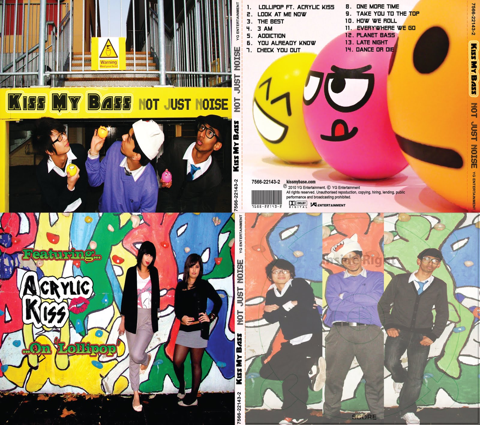
Here are some album covers that inspire the initial ideas of my own album cover [visualization, colour, composition]
 The band members have been photographed individually but during editing, they have been given a 'panel' each which cuts the side of their full body for example, shoulders, arms and the side of the heads are cut off. The use of black and other dark colours respectively compliment the name of their debut album named 'Just Blaq' pronounced black. I am inspired to use a paneled image like this one and see how it works with my own band.
2. Kanye West - 808's & Heartbreak
 The front cover (right) for this is simplistic and has a literal image of the heart being torn, as the title of the album says '808's & Heartbreak' . The back cover (left) shows the artist West, with an elongated heart coiled around his arm and waist. As the background image is animated and the foreground image of West is real, the art behind him comes to life as the heart squeezes him. West is not shown on the front cover as this album is not a debut album, therefore he must have an existing fan base already. The colours of this album inspire me as it is bright and colourful which would suit the Korean Pop genre which I have chosen for my video.
N.E.R.D. - Everybody Nose (All The Girls Standing In The Line For The Bathroom)
 Technically this is a singles cover, but the composition and colours inspire me as they are bright and vibrant. Also the paneling or sectioning is present here like MBLAQ's album. Each band member is given a colour and a section of the cover. Each member does something different with their hands though are standing in the same way. Although this album has nothing to do with the name of the single, the fact is that they are recognized regardless of what is represented on the cover as N.E.R.D.
M.I.A. - Kala

 This is M.I.A.'s second studio album, and on this album, her face is shown at the center slightly obscured behind the glasses and hat, but again he fan base is established at this point. Four of the same images are placed under name and above her album name. The album cover as a whole looks like a viral ad or subliminal message, as the pixelated fills of the lettering look like a computerized message and the repeated 'Fight On!' message circled around M.I.A. herself. There is an interesting colour contrast between the background (blue, green and purple) and foreground font (red and yellow), which causes every element of the album to stand out. The back of the cover, however, is slightly confusing as the choice of background behind the song list is too overbearing resulting in difficulty to be able read the song titles.
Here are some album covers that inspire the initial ideas of my own album cover [visualization, colour, composition]
1. MBLAQ - Just Blaq
 The band members have been photographed individually but during editing, they have been given a 'panel' each which cuts the side of their full body for example, shoulders, arms and the side of the heads are cut off. The use of black and other dark colours respectively compliment the name of their debut album named 'Just Blaq' pronounced black. I am inspired to use a paneled image like this one and see how it works with my own band.
 2. Kanye West - 808's & Heartbreak
 The front cover (right) for this is simplistic and has a literal image of the heart being torn, as the title of the album says '808's & Heartbreak' . The back cover (left) shows the artist West, with an elongated heart coiled around his arm and waist. As the background image is animated and the foreground image of West is real, the art behind him comes to life as the heart squeezes him. West is not shown on the front cover as this album is not a debut album, therefore he must have an existing fan base already. The colours of this album inspire me as it is bright and colourful which would suit the Korean Pop genre which I have chosen for my video.
 N.E.R.D. - Everybody Nose (All The Girls Standing In The Line For The Bathroom)
 Technically this is a singles cover, but the composition and colours inspire me as they are bright and vibrant. Also the paneling or sectioning is present here like MBLAQ's album. Each band member is given a colour and a section of the cover. Each member does something different with their hands though are standing in the same way. Although this album has nothing to do with the name of the single, the fact is that they are recognized regardless of what is represented on the cover as N.E.R.D.
 M.I.A. - Kala

 This is M.I.A.'s second studio album, and on this album, her face is shown at the center slightly obscured behind the glasses and hat, but again he fan base is established at this point. Four of the same images are placed under name and above her album name. The album cover as a whole looks like a viral ad or subliminal message, as the pixelated fills of the lettering look like a computerized message and the repeated 'Fight On!' message circled around M.I.A. herself. There is an interesting colour contrast between the background (blue, green and purple) and foreground font (red and yellow), which causes every element of the album to stand out. The back of the cover, however, is slightly confusing as the choice of background behind the song list is too overbearing resulting in difficulty to be able read the song titles.
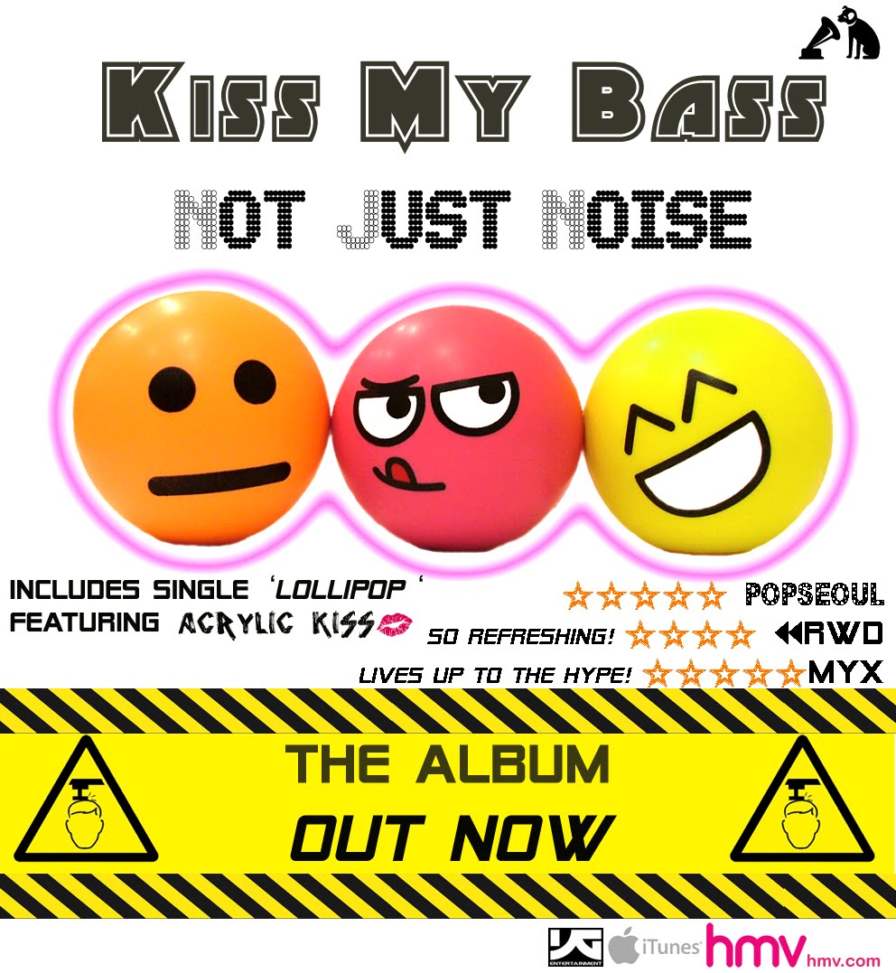
0 comments:
Post a Comment